Losing grip – color choice
G’day fellow drifters, as well as all you bashers out there that really should give drifting a go. By all means, do a couple of speed runs and burn some rubber with your Arrma Infraction. Then, when your 6S batteries are out of juice, grab your drifter for some relaxing, beautiful and smooth drifting. All in the same parking lot. Finally, hand the drift transmitter over to the local kids who’ve come to take a look, and have a coffee while you watch them trying to get to grips with losing grip.
Heed my word, but that’s all the evangelization you’ll get from me today. Now, onto my main topic for the day. Colors. I will not dwell on the technicalities of painting in itself. Suffice to say that I’m a rattle can man, yearning to go airbrush. What I will talk about is color choice. Buying and painting a body is a fair investment of money, so you want it to look good, right? Therefore, chose your colors wisely. There’s lots and lots of tutorials on the technicalities of painting out there, but funnily enough I haven’t seen much written about how to actual pick colors in regards to painting RC bodies.
Let’s start thinking about superheroes. Do you think it’s a coincidence that Superman has blue tights, a red cape and some yellow accents? Or that Captain Marvel sports the same colors? That the Hulk is green, with purple trousers? That Iron Man has a red and yellow suit, with blue lights? That Poison Ivy in Batman and Mera in Aquaman both have red hair and a green dress? Of course not, whoever designed those outfits knew their color theory, and picked colors that created striking combinations.
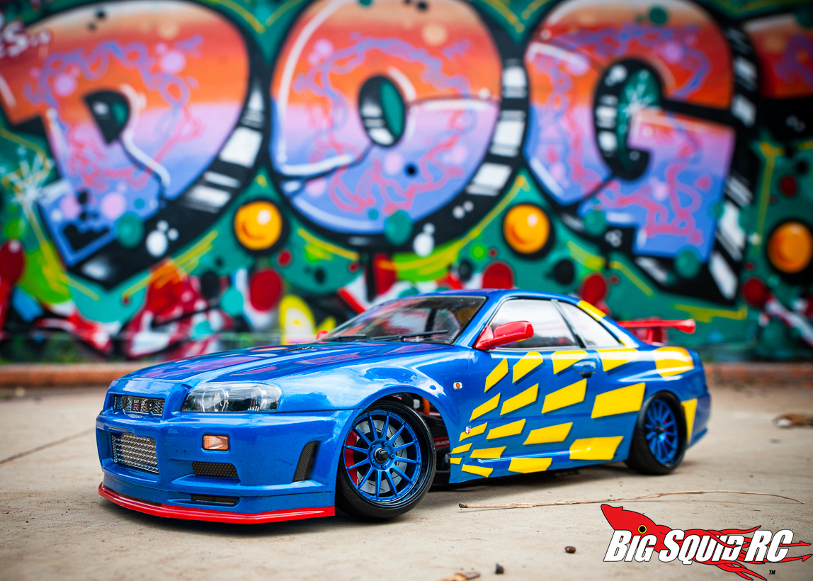
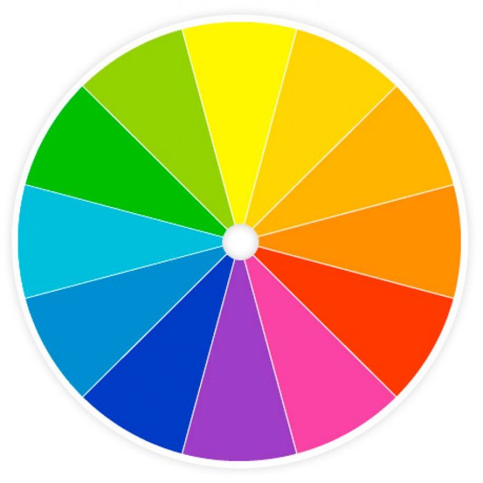
Some of us have a natural feel for how to match colors, but me, I find that some theory helps. For my Nissan, I decided to go fail safe and use what is called a triadic color scheme – three colors that are evenly spaced around the color wheel. Have a look at the color wheel below and you will see what I mean: my colors are at twelve, four and eight o’clock – evenly spaced. While I chose the primary colors of blue, yellow and red, you could also do it in the secondary colors of green, orange and purple (the Green Goblin) or the mid-tints in between. In any case, using triadic colors makes for a quite vibrant look, perfect for a drifter.
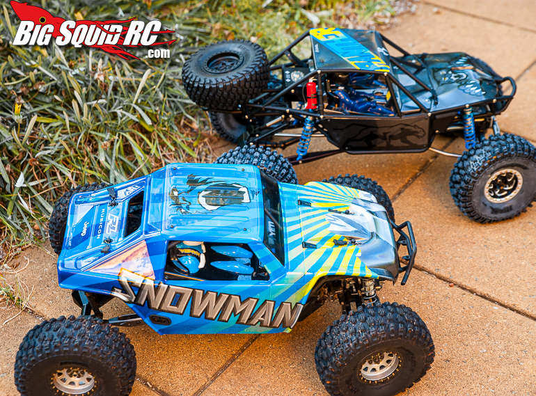
It should also be noted that the safest way to use it, is to let one color dominate and use the others for accent. On my Nissan, blue is obviously dominating, with yellow complementing it and red being used as a spot color to tie it all up and bring it together. Had I painted the red details yellow instead, I dare say the body would lose a lot of pop and not be as striking. For my Axial Yeti and Axial Bomber I chose the same colors. The Yeti is dominated by blue, nicely complimented by yellow. Since grey is neutral, it works well for the text on the side and the mountain (yes, it’s supposed to be a mountain. Machapuchare, in Nepal, to be precise) on the hood. However, no red on the Yeti, and hence it lacks a bit of a punch. Same colors on the Bomber, where I also addded a red fire extinguisher as an accent.

Should you want a somewhat less vibrant and more harmonious look, you’d be wise to opt for an analogous color scheme – picking three colors that are next to each other on the color wheel. One to dominate, one to support, and one as an accent. Picture my Nissan in blue, with the yellow replaced by blue-green and the red by blue-purple. A bit more discreet, without being bland.
If you want to go cheap, and use only two colors, a complementary color scheme might be a good idea. These are colors that are opposite each other on the color wheel, like red and green (Mera in Aquaman), purple and green (the Hulk) or blue and orange (actually, it might be debated whether orange or yellow should be opposite blue). This provides high contrast and impact, but can be tricky to use. You would want one of the colors to dominate, and the other to be an accent. Sort of like my Yeti.
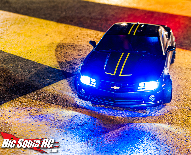
An easy and striking two color scheme would be black and yellow – a classic combination if you want to look dangerous. Think wasps and garden spiders. That’s what did for my Camaro. Nice and simple.

This was of course only a very brief introduction to color theory, and in the end it is up to you whether or not to consider it next time you paint a body. I would not want to say it is meant as a pointer in the right direction, since tastes differ, but rather one way of approaching color schemes. One that can be found, for example, in Pro-Lines airbrush paint sets; among them you’ll find one with primary colors, and one with secondary colors. If you pick up one of those, and nothing else, you’re home safe.
That’s what I would do, if only I had an airbrush. In order to step up my game, that’s what I would need, since it is a bit difficult to do involved color schemes with rattle cans. There’s sixteen layers of paint on my yeti, which made it more and more difficult to peel the masking as the paint built up. With an airbrush, there wouldn’t be as much overspray, and coats could have been thinner, while still even. Remains to be seen whether I can divert enough funds to get one. And whether I will get an airbrush, or another drifter. Goodness, that’s a dilemma for a happy man!
As always, hit the link to read more Losing grip columns. See ya next week!